A pink and green wedding sounds like it belongs somewhere lush and tropical. But New Mexico proves otherwise. Against high desert light and adobe walls, this palette does something unexpected in the most beautiful way possible.
Hi! We’re Verdeaux & Co., a full-service wedding planning and design studio serving New Mexico. We design refined, intentional celebrations that feel connected to their setting. Because of that, we approach bold color palettes the same way we approach every design decision: with real restraint and intention.
In this post, we’re covering how a pink and green wedding is translated in a desert setting. We’ll walk through shade selection, seasonal florals, and how the palette carries not only through your tablescape, but your entire celebration.
If you’re ready to start planning a pink and green wedding in New Mexico, we’d love to help. Learn more about our planning services, browse our portfolio, or contact us to get started!
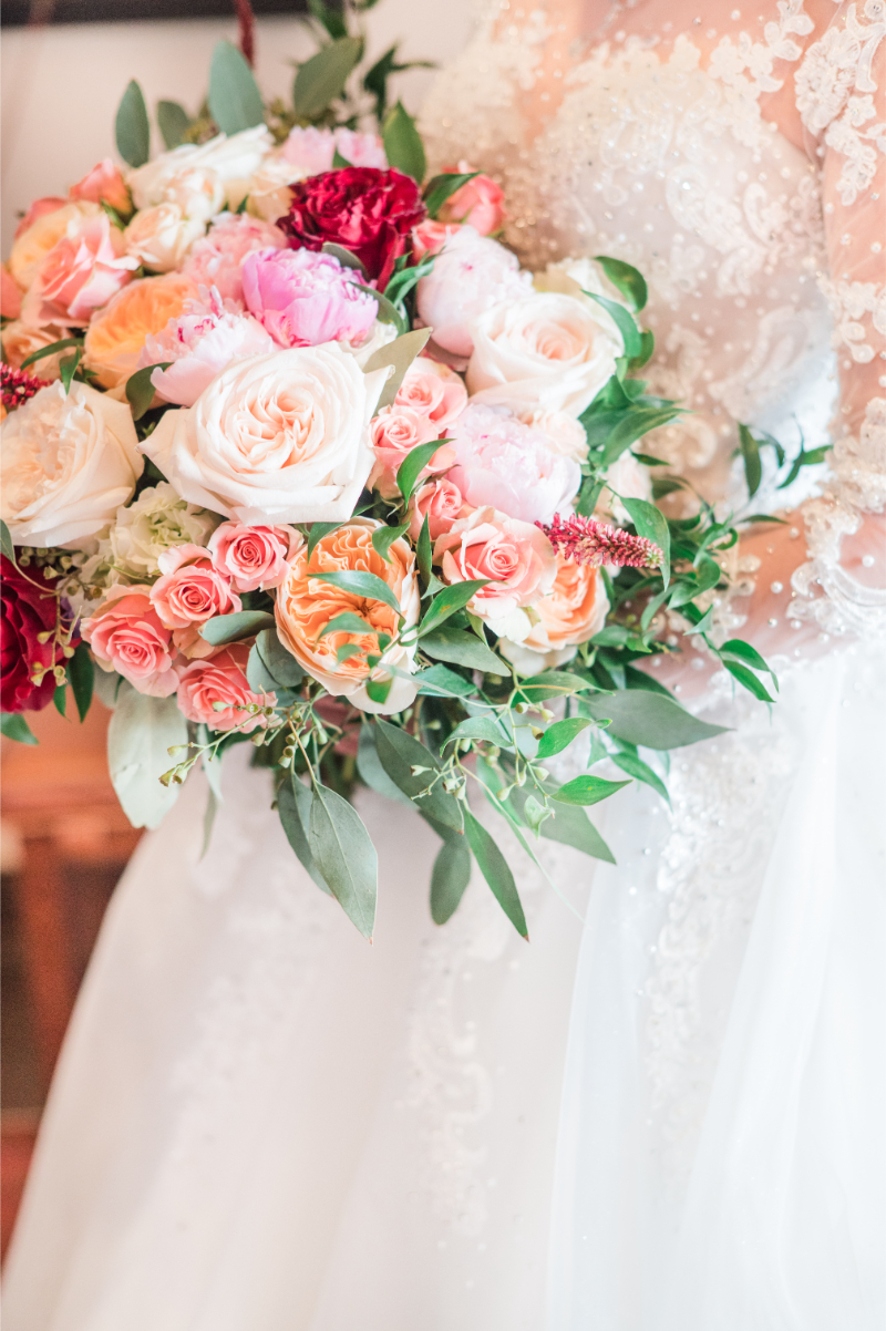
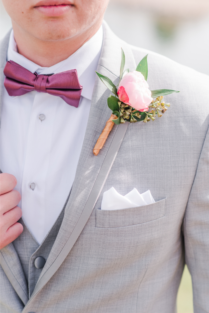
Photo Credit: Maura Jane Photography
What Pink and Green Do in a Desert Setting (Hint: It’s More Striking Than You’d Expect)
Most couples assume bold color needs a lush, garden backdrop to work. New Mexico’s desert setting argues otherwise. Against terracotta adobe and a wide turquoise sky, pink and green read as vivid and sleek.
If you’re unfamiliar with the area, the New Mexico desert already provides this palette naturally. For instance, prickly pear and claret cup cactus bloom in saturated pink every spring. Meanwhile, sage, agave, and yucca supply the varied shades of green. Because this pairing already exists in the landscape, a pink and green wedding in New Mexico feels rooted.
Overall, that relationship between color and landscape matters more in New Mexico than almost anywhere else. Light here is bright and direct, and it makes saturated color read even brighter than it would elsewhere.
Now that you understand why this palette works here, selecting the right shades becomes the next decision.
To see how bold colors and the desert landscape work together, read our feature on desert botanical garden weddings in New Mexico.
The Shades That Matter: Which Pinks, Which Greens, and Why the Balance Is Everything
Not every pink and every green pair well together, so balance matters enormously.
For Softer, Romantic Palettes
Dusty rose and blush paired with sage or olive green.
This combination feels romantic and refined, well suited to garden-style or vintage-inspired celebrations.
For Bolder Color Palettes
Fuchsia and hot pink against emerald or forest green.
That pairing feels vibrant and confident, ideal for couples who want their color story to make a real statement.
Still, value and saturation should match across both colors. Pairing a soft blush with a saturated emerald, for instance, can feel unbalanced instead of intentional.
Want to see how shade balance comes together in the tablescape? Parooze our guide of spring centerpiece ideas.
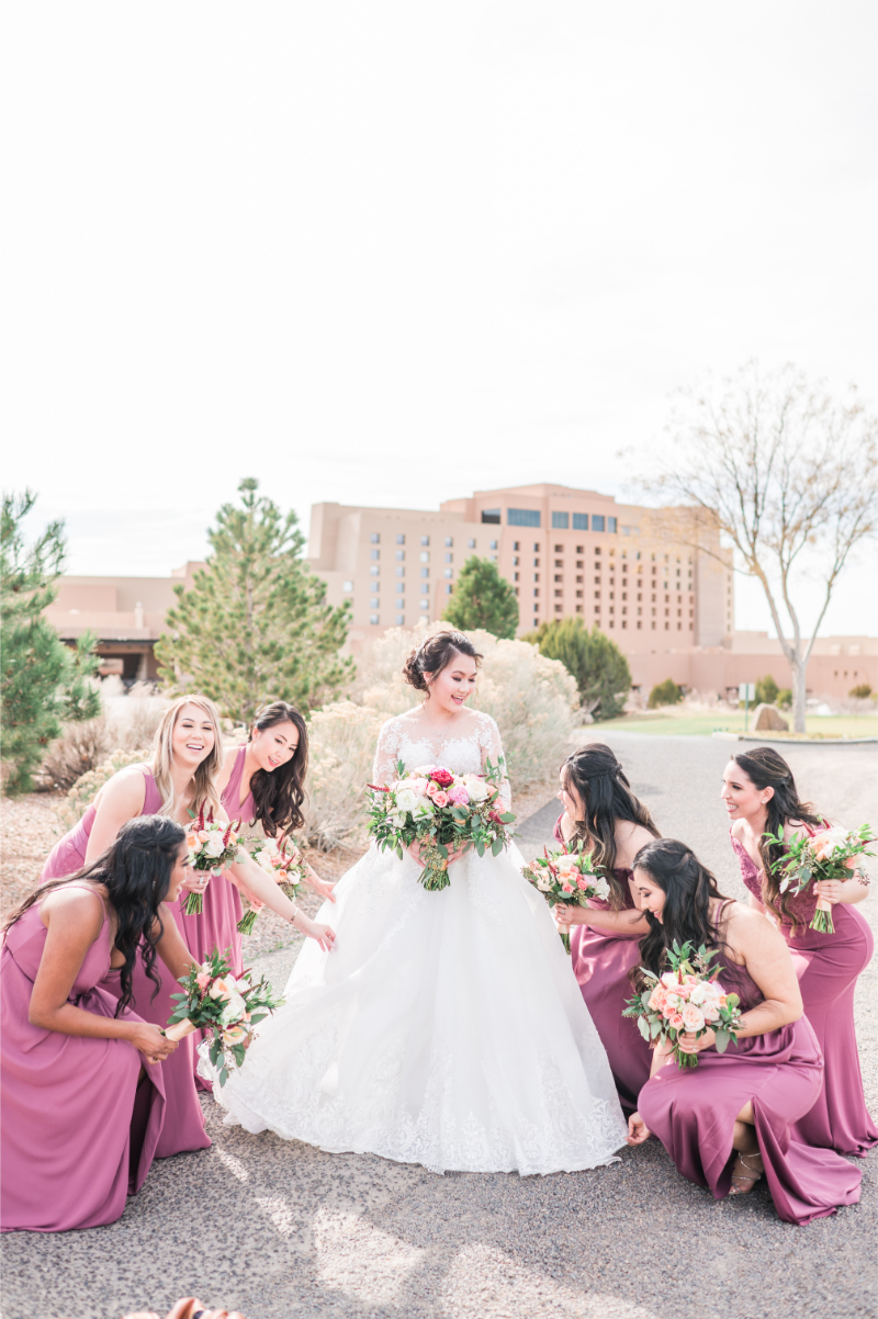
Photo Credit: Maura Jane Photography
Florals That Deliver on This Palette in New Mexico’s Seasons
With your shade direction settled, florals bring the palette to life. Because New Mexico’s growing seasons shift dramatically, your bloom selection should shift right along with them.
Spring – Soft Blush with Sage
- ranunculus
- tulips and
- sweet peas
- fresh sage
Summer – Saturated Pinks with Cacti
- garden roses
- cosmos
- echeveria
- succulents
Fall – Mauve and Rose with Deep Sage
- dahlias
- amaranthus
- Fresh sage
Across every season, native greenery, sage, olive branches, desert sage specifically, keeps the palette grounded. That consistency ties your florals back to the region regardless of the season you celebrate.
For a deeper look at seasonal bloom selections, read our guide to fall wedding flowers for New Mexico.
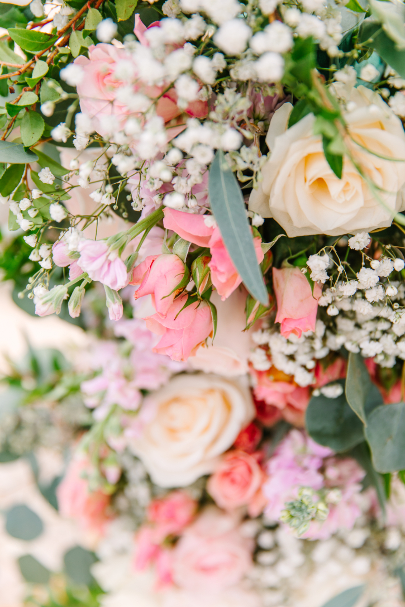
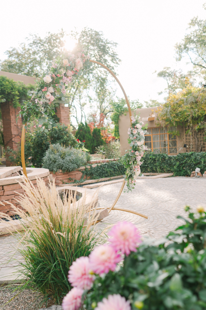
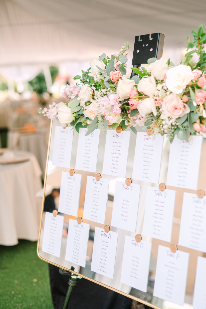
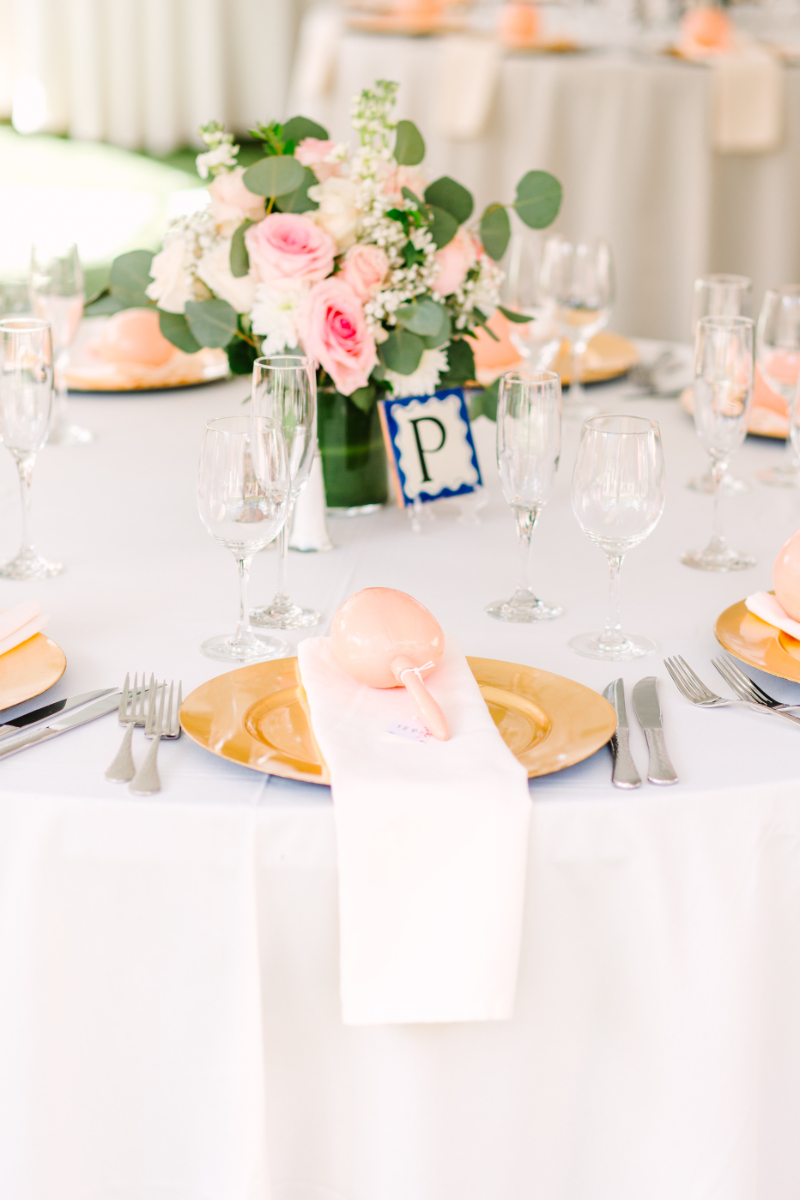
Photo Credit: Maura Jane Photography
Bringing Pink and Green Into the Tablescape, Linen, and Reception Design
Once florals are chosen, the palette needs to extend across your full reception design. A pink and green wedding should feel consistent from ceremony to farewell.
A few ways this palette translates beautifully to tablescape design:
- Neutral linens with pink floral accents keep the palette from feeling overly saturated across an entire room.
- Green glassware or emerald votives add color without requiring additional floral budget.
- Bud vase clusters mixing pink blooms with trailing greenery create movement across a long table.
- Menu cards and place settings in soft sage or blush tie smaller details back to the larger story.
Overall, restraint matters here just as much as it does with shade selection. A few well-placed accents usually read as more intentional than color on every single surface.
Our post on bud vase centerpieces walks through exactly how to build that layered, tablescape-ready look.
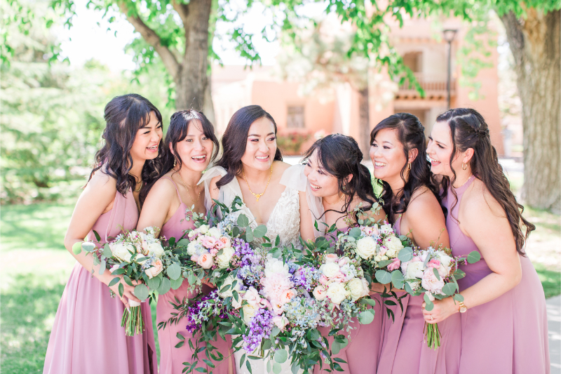
Photo Credit: Maura Jane Photography
Bridesmaid Color Direction and Attire That Holds the Palette Together
With your reception design settled, attire is the next place this palette shows up. Bridesmaid dresses and personal florals should reinforce the story, not compete with it.
Typically, uniform sage green dresses paired with pink bouquets create a clean, cohesive look. Alternatively, mismatched dresses in a range of blush and rose tones can feel relaxed and personal. That works especially well for garden-style celebrations.
Either direction works well, provided the palette stays consistent with your florals and reception design. Attire that pulls from a completely different color family can undercut the cohesion you’ve built elsewhere.
Personal bouquets deserve particular attention too. They bridge the gap between attire and the rest of your floral story.
For more on scaling florals to match the drama of your overall color palette, read our guide to tall flower arrangements.
Taking the Pink and Green Vision From Mood Board to Finished Design
With every element planned, execution is what brings the vision to life. Translating a mood board into a finished design takes more editing than most couples expect.
Typically, Pinterest boards collect dozens of pink and green wedding references pulled from wildly different settings. Narrowing those references into one cohesive direction is where the real design work happens.
A planner’s role here matters enormously. Editing down infinite inspiration into a focused palette is the real work. Applying it consistently across every vendor keeps the finished wedding from feeling scattered.
Ultimately, the strongest pink and green weddings feel edited, not accumulated. Every choice should trace back to the same core palette decision made at the very start.
To turn your scattered inspiration into a clear design direction, check out our post on creating a wedding vision board.
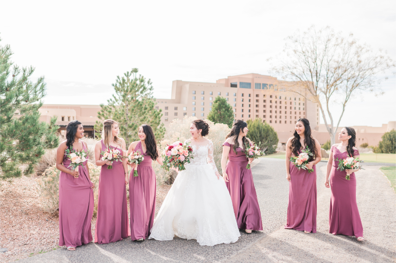
Photo Credit: Maura Jane Photography
A Pink and Green Wedding that Feels Native to New Mexico
A pink and green wedding doesn’t need a lush garden to feel striking. New Mexico’s own desert palette of terracotta, sage, and wide open sunsets, makes this color story feel completely at home here.
From shade selection to florals to the final tablescape, every decision should reinforce the same balanced, intentional direction. When it does, the palette feels like part of the landscape, not something layered on top of it.
If you’re drawn to this color story and want it designed with real intention for your New Mexico wedding, we’d love to help. Learn more about our planning services, take a look at our portfolio, or contact us to get started!


